7 Styling Secrets: Shelves
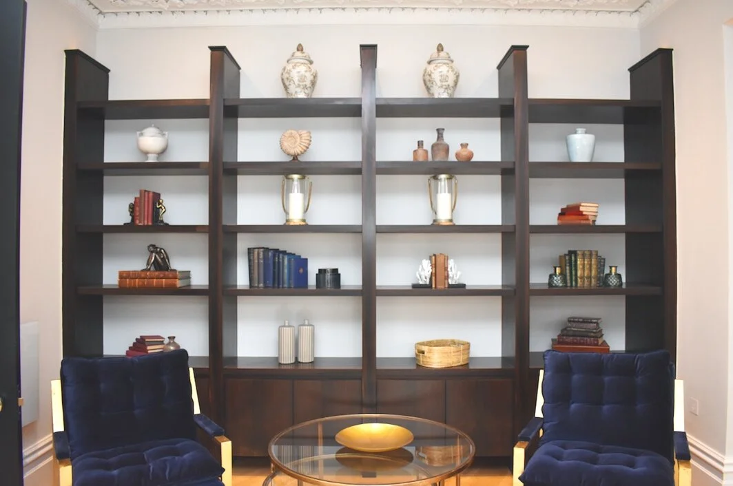
1. A huge shelving unit can be daunting to tackle, but don’t be pressured into thinking that every shelf must be filled. Here we have placed a few duplicate items to anchor the scheme, then similar sized objects in the surrounding spaces. The interest comes from the eclectic mix of pieces. Stick to a limited colour palette of tones that compliment each other so the overall effect remains coherent.
2. Books books books! In my opinion, they are second only to flowers and plants for breathing life into a room, And they’re so versatile to play with when it comes to styling. Stack them to the left, stack them to the right, vertically or horizontally - mix them up with ornaments or wedge between beautiful bookends to create an object d’art all their own!
3. Don’t be tempted to overfill your shelves. Beautiful accessories are best shown off when they have a bit of space to breathe. Here we have created two simple columns using central positioning of predominantly single pieces to create a simple but impactful design feature. the shelves look stylish but not cluttered - less really can be more!
4. Avoid sticking any old items on a shelf – ornaments need to be of relevance to the room. In this home office we’ve chosen paperweights, boxes and books, along with the odd decorative item to add a bit of personality. Keeping it simple gives a lived in vibe but still allows the beautiful artwork to be star of the show.
5. The objects on your shelves should compliment rather than compete with your room, both in colour and style. A predominantly classic room would look strange with wildly modern accessories and vice versa. we never inject too many contrasting colours that would be in danger of clashing or fighting against each other. think of your shelving as a work of art - yes, there will be stand out touches, but essentially, everything needs to work together.
6. Shelf styling doesn’t have to be too planned and considered – when things are too ordered it can wind up looking a bit contrived. here we’ve grouped similar bottles and vases to create a more casual feel and help personalise and relax this otherwise formal schemE.
7. Inbuilt shelves that take up much of a wall can become the key feature and focal point of a room, so it’s important they don’t end up looking like a muddled mess! In this living space, the colour scheme is neutral which we’ve reflected in our choice of ornaments. The result? instead of taking over, the shelves compliment and blend into the scheme, becoming a point of interest rather than an overbearing presence.


